This series introduces the foundation for web development using basic HTML and CSS markup. It is intended for those who have zero web development experience, though it might be a solid "foundation" refresher for anyone.
HTML & CSS Basics Series →
Finally! We’re going to get to the layout of the page and make it look like a website. In the past few tutorials, we’ve been exploring some of the HTML and CSS fundamentals needed to start this, and now we’re going to dig in. As of the last tutorial, you should have three HTML pages with some simple text that link together—you can check out how they’re supposed to look here (opens example in new tab).
This time, we’re going to start structuring the homepage to look a web page you might actually use while exploring the box model and a few new page elements.
Step 1
To get started, we’re going to put all of the existing content on our page into one big box that will serve as a visual background for our content. So in your index.html page, add a <div> with a class of “pagebox”, opening it directly below the opening <body> tag and closing it directly above the closing </body> tag, like so:
<body>
  <div class="pagebox">
    <!-- All my content goes here! -->
  </div>
</body>
Step 2
Now we’re going to define the class “pagebox” in our CSS to actually make it look like a big box surrounding our content. And since I want this box to be white, I’m going to have to make the page background a different color so I can see the white box—I’ll do this by adding a body selector. Copy and paste or type in the following styles to the top of your CSS (don’t worry if you don’t understand all of the syntax, I’ll explain below).
body {
  background-color: #ccc;
  margin: 0;
}
.pagebox {
  background-color: #fff;
  width:940px;
  margin: 0 auto;
}
If you look at the resulting index.html page in your browser, you should now see the content inside a white box, centered in the middle of the browser window, like this:

Figure 1: Screenshot with content centered in pagebox
Now we have an actual box to explore the box model with!
The Box Model
The box model is quite simply a visual model that we can envision when trying to understand what CSS declarations do to any particular HTML elements. Quite literally, every single element on your page is in a box—even if you can’t see the actual box. (You may want to read the official W3C spec, or a great CSS Tricks article for more info.)
We’ve already defined some of the most common declarations described by the box model: a white background, a 940 pixel width, and a margin (the area outside the box—we defined ours as zero and auto… which is a little confusing, we’ll come back to that below.)
Step 3
Let’s add one more declaration, padding , to give our content a little breathing room:
.pagebox {
  background-color: #fff;
  width:940px;
  margin: 0 auto;
  padding: 40px;
}
Now there should be some space:
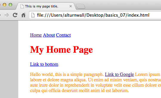
Figure 2: Padding between content and box edge.
Using browser development tools
Cool! We have our first box on the page that we can actually see—a big white box holding all of our text content.
One of the easiest ways to visualize this is using the development tools on modern browsers. They all have them, but I primary use Google Chrome, and the next few steps are specific to that particular browser. I recommend following along with this series using Chrome, as you’ll be able to follow the screenshots more easily.
In Chrome, move your cursor over the white padding we added to our box, right click, and select “Inspect Element”. With any luck, the result should look something like the screenshot below:

Figure 3: Screenshot of Chrome’s browser (inspect element) tools turned on.
Amazing! Right? You can actually visualize the page, and see the HTML and CSS you’ve been writing in the panel below. This tool is extremely helpful in development and debugging, so get comfortable with it.
You may have to move your cursor around a little bit to see the info you want, and you can drag the inspector panel up and down to reveal more information. Also, play with the icons on the top of the panel. Press the magnifying glass all the way on the left to enable the live inspector, so that when you move your cursor over any elements on the page, you’ll see their “box” highlighted. Click on any element’s “box” in this mode, and it’ll highlight the corresponding HTML and CSS below.
Also, take particular note of the box model diagram in the right CSS pane (you may have to scroll down to see it:
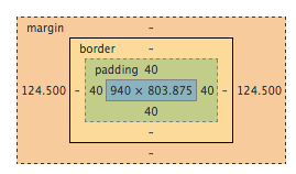
Figure 4: Chrome’s “Box Model” diagram for our “pagebox” div.
This gives you information about the box model on the element, and is a great way to start thinking about how you build your pages. The model above is for our “pagebox” div. Notice how the numbers correspond to the CSS we wrote for the element:
.pagebox {
  background-color: #fff;
  width:940px;
  margin: 0 auto;
  padding: 40px;
}
The blue in the middle of the box indicates that the dimensions are 940 pixels wide by 803.875 pixels high. The 940 came from our width declaration in the CSS, but where did the 803.875 come from? That height is the computed value, meaning that since we didn’t set a height on the element, it’s going to take up as much space as it needs, based on the content inside of it—in our case some headers and paragraphs of dummy text. (Yours might be a slightly different number.)
The greenish layer around the central box indicates the padding for the element. Note how all of the values are 40 pixels. This is because we only defined a single value for padding in our css, so it therefore is applied to all sides of the box. (This is called a shorthand declaration, we’ll explore more about those in the next post.)
The next yellow-orange layer indicates the border . We did not define a border on our box, so all of the values are null, or “—” Had we defined a border, we’d see dimensions here too.
The outermost orange layer is the margin. Our values are null “—” on the top and bottom, and 124.500 on the left and right (again, your left and right values may differ based on the size of your browser). Huh? This corresponds to the line in our CSS that says margin: 0 auto;. The zero is the top and bottom, and the auto is the left and right. Because we stated “auto”, the left and right values are computed again, which is the handy trick that keeps our box centered in the middle of the browser window, regardless of how wide the window is. Go ahead and try resizing your browser window. You should see the white box remain in the center of the window with a margins on either side that are the same width.
Adding more boxes
This probably generated more questions than answers right now—and we’ll get to them all. For now, let’s add a couple more “boxes” to our page so we can start practicing different uses of the box model. Most websites have a header and a footer, so we’ll start there.
Step 4
We’re going to add three more divs to our index.html page:
<body>
  <div class="pagebox">
    <div class="siteheader"></div>
    <div class="maincontent">
      <!-- All my content goes here! -->
    </div>
    <div class="sitefooter"></div>
  </div>
</body>
Pay particular attention to where you are opening (<div class=”something”> ) and closing (</div> ) your div elements. It may help to look at my full page of code at this point, which you can see in another tab here, or download here. Note that the comment you see in the code above is actually where all of our paragraphs and headers still are.
Parents, children, descendants?
The boxes are basically invisible right now, because we have not given them any styles. But note that all three of the new divs are contained within “pagebox” because they open and close in between the opening <div class=”pagebox”> and it’s corresponding closing tag </div> (located all the way at the bottom of the page immediately preceding the closing </body> tag).
When a box is inside of another box like this, we call it a child or descendant of the containing box, which we call the parent.
In this case, “siteheader”, “maincontent”, and “sitefooter” are all children and descendants of “pagebox”, which we call the parent. It’s useful to learn and use this terminology as we move forward and start making our pages more complex, so take a second to review the code and really understand the relationship of each of the elements.
Taking the idea of the box model one step further, here is a conceptual model for how our page is currently structured:

Figure 5: Diagram of the box model as applied to an entire page.
You can see how the opening and closing div tags construct the “top” and “bottom” edges of each box. Even though we can’t see the boxes yet, this is the model for how the page is laid out.
Step 5
Let’s add some styles to our new boxes so we can see them—you can place these styles at the end of your style.css file:
.siteheader {
  background-color: #f0f0f0;
  margin-bottom: 30px;
  width: 100%;
  min-height: 100px;
}
.maincontent {
  background-color: #eddcba;
  width: 100%;
}
.sitefooter {
  background-color: #94cdd1;
  margin-top: 30px;
  width: 100%;
  min-height: 100px;
}
I had to zoom out to get it all to fit in the window, but now your page should look something like this, with a grey header box at the top, all of your content in a yellowish box, and a footer box that’s bluish:

Figure 6: Our page with the header and footer boxes added. (Zoomed out)
Look closely at all of the css declarations you just wrote, and try to understand what each of them did visually. Remember, you can use your browser’s developer tools to inspect each of the boxes. If your page doesn’t look like the screenshot above, go back through both your HTML and CSS and ensure that you added the code in the appropriate places, and don’t have any typos. Remember to right-click and use your the inspect element tool to troubleshoot.
There are a few new declarations at work here:
margin-top and margin-bottom
Instead of using the shorthand margin , like we have previously to add values to all sides of the box, we are now only applying a value to a single side. You can also use margin-left and margin-right.
min-height
I added this to the boxes so that we could see them because they don’t yet have any content and would otherwise be invisible (0 pixels high). Adding the “min-” to the front of the box means that it’ll take up at least this much space, but if the content inside were to need more space to fit into, the box would grow. Alternately, when you want to force an element to remain a specific height, you can just declare height without the “min-“.
width:100%;
We’ve used width before, but this time we declared a percentage value, instead of an absolute pixel value. 100% means that the element will take up the full amount of space of whatever it’s containing parent is. Since the parent of these boxes is our “pagebox”, they take up exactly 940 pixels. (Remember, the white border around everything was caused by the padding. Right-click to use the inspect element tool to visualize this.)
I just stuck the yellowish color in there to illustrate where that particular box begins and ends, but I’m going to take that out, as it’s pretty ugly and we want to start making our pages look good! So either go back to your “maincontent” style bock and delete the background-color:#eddcba; line, or comment it out, like I have below:
.maincontent {
  /* background-color: #eddcba; */
  width: 100%;
}
Note how comments look different in CSS than HTML.
Use the /* */ syntax to comment in CSS (as well as javascript).
Now our page is looking pretty good.
Step 6
As a last step, let’s take the links that we made in the previous tutorial #5 and add them to our header box, which is where the navigation usually lives. In your HTML, find the three page links:
<a href="index.html">Home</a>
<a href="about.html">About</a>
<a href="contact.html">Contact</a>
And add them inside of the “siteheader” div, like so:
<div class="siteheader">
  <a href="index.html">Home</a>
  <a href="about.html">About</a>
  <a href="contact.html">Contact</a>
</div>
Now our home page (index.html) is really starting to shape up:
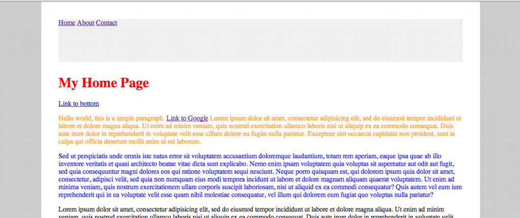
Figure 7: Homepage with the yellow removed from the maincontent box, and the links placed in the header.
Step 7
In the next tutorial, we’ll continue with styling the navigation and additional sections of our pages. Before we do that, let’s use the same layout that we just applied to our index page (all of our new boxes), and add it to our other two pages (about.html and contact.html) as well, to get them ready for the next tutorial. This will help you practice adding the code to the correct place. If you do it right, your about page should look like this:
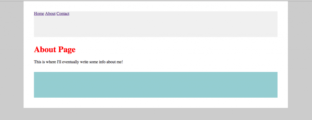
Figure 8: About page with new layout added.
It might help you to see what mine actually looks like in the browser—click here to open the example site in a new tab. Click the links at the top—they still work, and they take us to our newly styled pages! (And you can also download the completed tutorial files here.)
The power of CSS
Did you notice that all three of your pages now look similar? And all you had to do was add the HTML to the new pages, right? If you think about it, that’s really awesome. You only had to write the CSS a single time and because you included the link to the same CSS file in the <head> of each of your HTML pages, they all use the same style!
Step 8
Just for fun, why don’t you try changing the color on one of your boxes. I’ll change the header:
.siteheader {
  /*background-color: #f0f0f0;*/
  background-color: #d69f3c;
  margin-bottom: 30px;
  width: 100%;
  min-height: 100px;
}
Look again at all of your different pages. You changed the code in a single place, and it automatically updated on all of your pages!
This is why it’s so useful to separate the content and style with HTML and CSS—if you structure your site the right way, you can quickly make site-wide changes to design from the CSS. Remember back in tutorial 4, where we discussed the differences between the two, and took a look at CSS Zen Garden? Now we’re applying those same concepts to our own code.
Wrapup
Our page design is starting to take form! Next time, we’re going to make some different layouts on our different pages, applying the same box model concept we learned today, and learning some new declarations.
To see the final result of this tutorial—click here to open the example site in a new tab. And you can also download the completed tutorial files here.
Any questions? Please leave a comment below!
Next tutorial coming next week…
Hi when will the next tutorial be coming?
I’m waiting aswell :/
Please post next one?? Awesome series though…
wheres the follow on tutorials please?
In transitioning from HTML to CSS, I’ve been scouring the Internet for weeks trying to find information that doesn’t a) assume I’m an idiot, or b) assume I know everything about CSS. *Finally* found your site, but it’s not enough! Thanks for this. I’d love to see more.
Hi There, perfect tutorial. Hope to see more soon.
One remark. Working with IE11 I needed to put in the index.html file to see all the CSS styling.
Thank you for the series. This is awesome stuff. I usually run into road blocks, trying to understand the basics of anything new but i was able to flow through the process much more smoothly. Thank you.
Hello,
Thanks for sharing such informative and helpful blog post and you are doing a good job so keep posting such amazing articles
Really appreciate you sharing this article post.Much thanks again.
Wow, I wasted my time on a Udemy class where the MIA instructor just breezes past everything, I was close to finishing the class but still had no understanding of the relationship of html to css. I actually used the search term of “relationship of css to html” and ended up here. Thanks Alex, I really understand this now.
This really did explain the relationship of HTML and CSS for me. Very grateful. Im sorry the following class never happened. Hope your ok. Thanks for what you gave.
THIS IS GREAT! Step-by-step, easy to follow. The only minor complaint I have is some of the screen shots are not working.