This course will extend what was learned in the HTML & CSS Basics series, venturing further into modern best-practices in HTML and CSS and introducing basic javascript.
Front-end Series →
One of the most basic features that the majority of websites share is a simple navigation menu that often includes some type of “dropdown”. These days, menus can take all shapes and forms, from the simple stacked list (left, below) to the “mega” menus including photos and other media (right side, below). We’re going to build the simple version on the left, though this starting structure can easily be repurposed to build more complex menus.

There are as many ways to code these as there are designs, but the basic functionality can easily be achieved using pure HTML and CSS (without any javascript), and happens to be a great tool to learn more about semantic HTML and CSS in the process.
Let’s focus on building the correct HTML structure on the page first. It all starts with the humble bulleted list, like so:
- Home
- About
- Services
- Web Development
- Graphic Design
- Branding
- Portfolio
- Design
- Photography
- Interactive
- Contact
This is a sample menu that might be found on a portfolio website. The first level of bullets (Home, About, Services, Portfolio, Contact) are the “top-level” navigation items, which are always visible.
Here, there are two “sub menus” which are represented by the indented bullets under both the “Services” and “Portfolio” sections. We should be able to see these after we hover over the top level.
In addition, each of the bulleted items in the menu should be a link to a corresponding page. Although we’re not going to actually make those pages here, for the purposes of the tutorial, we’ll add links to each item with destinations of separate HTML pages, sharing the same name.
Step 1
Here’s what our HTML should look like. Type or paste this into your HTML file wherever you want your menu to appear (probably at the top of the page, under the opening <body> tag).
<nav class="site-navigation">
 <ul class="menu">
  <li><a href="home.html">Home</a></li>
  <li><a href="about.html">About</a></li>
  <li><a href="services.html">Services</a>
    <ul>
      <li><a href="web-development.html">Web Development</a></li>
      <li><a href="graphic-design.html">Graphic Design</a></li>
      <li><a href="branding.html">Branding</a></li>
    </ul>
  </li>
  <li><a href="portfolio.html">Portfolio</a>
    <ul>
      <li><a href="design.html">Design</a></li>
      <li><a href="photography.html">Photography</a></li>
      <li><a href="interactive.html">Interactive</a></li>
    </ul>
  </li>
  <li><a href="contact.html">Contact</a></li>
 </ul>
</nav>
Let’s have a bit of HTML review:
The <ul> tag is an unordered list, and the <li> tag is a list item. These elements together, generate a default list this looks something like this on your HTML page:

This appears as a bulleted list because of the <ul> tags. If we were to use <ol> tags instead , the list would be numbered. (See this reference for more info on ordered lists.)
If you’re following along in the series and using HTML5Boilerplate as a base, when you pasted this onto your page, you likely did NOT see the bullets, instead, your list probably looks like this:

That’s because we nested our list inside a <nav> element (more info here) , and HTML5Boilerplate includes this smart bit of code in the normalize.css file:
nav ul,
nav ol {
    list-style: none;
    list-style-image: none;
}
If you’re not working off of HTML5Boilerplate, you’ll want to add that snippet to your own CSS file. That code basically removes any bullets or numbers normally associated with ordered or unordered lists, as long as those lists are nested within a <nav> element. This is good for us, because we don’t want them in our design.
Step 2
Now we have all the HTML structure we need on our page—the rest of the magic is handled by CSS. So, open up your css file and we’ll get started styling.
If you’re working off HTML5Boilerplate, open your main.css file and add the following examples, somewhere between these two comments:
/* =================
   Author's custom styles
   ================= */


You'll add your code here!


/* =================
   Helper classes
   ================= */
First thing we’re going to do is remove all of the default margins and paddings that the browser assigns to our list elements, with this CSS rule set:
nav ul,
nav ol,
nav li {
    margin: 0;
    padding: 0;
    float: left;
}
nav a {
    display: block;
}
The second rule set gives all links within the menu a display type of block. Since links are inline by default, but here, we want them to define our menu structure, we need to convert them to block type.
Now, your menu should look all scrunched together, like this:

Already, notice how the second-level “sub nav” items are below the top items? That’s because we assigned display:block to all of the links, and everything is floated.
Step 3
To start styling our menu, let’s assign some visual styles to start defining what this all looks like. As you’re doing this, make sure you’re using your element inspector in the browser to get a better understanding of the structure of the menu. We’ll update our nav a {} rule set (updates highlighted):
nav a {
    display: block;
    padding: 1em;
    text-decoration: none;
    color: #d0d0d0;
}
The result should look something like this:

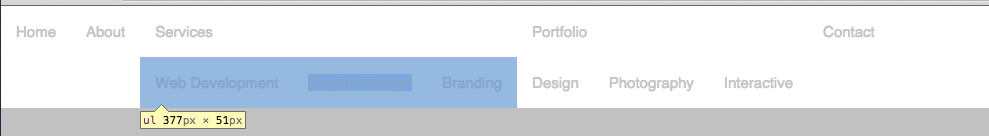
Here’s where it starts to get tricky. We want our dropdown menus to be stacked vertically, such that “Web Development, Graphic Design, and Branding” should appear top-to-bottom instead of left-to-right. So, what HTML element can we target in our CSS to make this happen? Take a look in your element inspector and see if you can figure it our yourself.
Step 4
The <ul> element that is nested inside of the “services” <li> (notably, NOT the top-level <ul> which has a class of menu), contains all of the links we want to change. So, let’s use that to style the dropdown:
nav ul ul {
    max-width: 11em;
    background-color: #585858;
}
I’m targeting only the second-level ul by using the cascade: in this case a <ul> inside of a <ul> inside of a <nav>.
Now, it should look like this:

Step 5
Because we limited the max-width of the <ul>, it forced the items inside to stay within that width, so they had to stack. The width of 11em is arbitrary—I chose it because it let the words stack without any being side-by-side, or any text wrapping.To ensure that this stacking happens even for short blocks, we can add the following code, forcing all <li> elements in the second-level <ul> tags to be full-width:
nav ul ul li {
    width: 100%;
}
You won’t necessarily see a change given the same example I’m using, so use your element inspector to see what happens before and after that code is added.
Here’s a quick example, with the <li> tags highlighted in green:

On the left: before width: 100% was added, and after, on the right.
Step 6
Now our dropdowns actually look pretty close to how we want them, but there’s a problem: the width of the dropdown is forcing the width of the parent menu item (services, portfolio, respectively) to be wider than they should. We can fix this with a bit of positioning:
nav ul ul {
    max-width: 11em;
    background-color: #585858;
    position: absolute;
}

Now, the dropdowns (correctly) no longer influence the width of their parent elements. But… they overlap. Any you may have noticed that they’re sitting behind some other content on the page. Notice in the screenshot above how our title “Example” overlaps the menus?
Step 7
We can fix the latter issue easily. Since the menus are already positioned absolutely, we can simply add a z-index to make them “higher” on our page render. We could fix it by adding a low value like “2”, but since we can reasonably assume that the menus should appear on top of most other content, we’ll give ourselves some leeway and use something higher:
nav ul ul {
    max-width: 11em;
    background-color: #585858;
    position: absolute;
    z-index: 99;
}
Now we just have the menus overlapping themselves. But… wait a minute.
We won’t actually encounter this when we’re finished, because we’ll only see a single dropdown at a time, once we’re hovered over a parent item. So, not that we have the structure set up, let’s see how the real CSS magic happens.
Making the dropdowns appear on hover
Quite simply, we want to “hide” the dropdowns until we hover over their parent link in the menu. The first part of that—the hiding, is one simple line:
Step 8
nav ul ul {
    max-width: 11em;
    background-color: #585858;
    position: absolute;
    z-index: 99;
    display: none;
}
Now, our top-level menu should be there looking good, while the dropdowns are hidden:

That’s the easy part.
Now we have to figure out how to make them appear when we hover over the correct link.
Step 9
This is why we used a list in the first place: it gives us the parent/child relationship structure we need to use.
Because our dropdowns are the <ul> elements nested inside of another <li>, we can write the following CSS to make the <ul> appear only when hovered over the containing <li>:
nav li:hover ul {
    display: block;
}
It’s as easy as that. Try it for yourself—when you hover over “services” only that specific dropdown should appear.
For reference, you can download a ZIP of my files here. And take a look at the working functionality of my code here →.
Now that we have our base functionality working, let’s add some more style to make it look good… [ coming soon ]
Thank u vey much. it is great!
Thanks for all the info!!! I place your instructions beside my text editor, Scite, and type out all your code all the while hitting Ctrl S and refreshing my browser with my page in it and finally getting a grasp on how this all works together.
Thanks for this. It really nails down the basic principles of how html, css, and the browser work together. Your instruction is, in my opinion, the go to source for beginning programmers!! thank You, I am looking forward to anything more you can bestow on us.
Jason P
I like it……… Can you show me the css to turn this into a dropdown menu ?
GO TO
Welcome
Beverages
Traditional Breakfast
Mexican Breakfast
Mexican Plates
Appetizers
Seafood
Barbecue
Kid’s Plates
Desserts
Thank you!